MamaMingle | Aesthetics
MILESTONE 4
Milestone 4
For this milestone, created a hifi prototype with detailed attention to color, typography, iconography, layout, and navigation. We also include a design system along with our prototype. The design system consists of a color palette, typefaces, icons, and a grid layout.
Moodboard
In order to bring our lo-fi prototype to life, our team began by creating mood boards to hone our individual ideas on the aesthetic and feel of the app. We considered images, color palettes, material samples, and descriptive words to capture the essence of our app. We then discussed our mood boards as a group, identifying elements that we wanted to incorporate into our final prototype by considering what we wanted to convey, what might resonate with users, and what would be aesthetically pleasing.


Color Palette
We made the collective decision to keep black as our primary color and use a variety of different light-shade pastel colors as our secondary colors. We made this decision because information is a major aspect of the application and it will contain multiple images and illustrations derived from diverse informational resources. Using a range of background colors to showcase these images will help underscore the breadth of content within the app. Additionally, a range of pastel colors not only allows us to convey energy and vibrancy, but the light shades prevent the designs from being loud or overwhelming.

Logo Ideation
After finalizing our color palette, we then moved ahead to create a logo for our application. We first went on the internet and explored various illustrations and images for inspiration. As we needed to stick to the course objectives we prioritized the user experience of our application over creating specific illustrations at the time. And so, we picked 2 illustrations from numerous photos and vectors available online. We wanted to center our application around these illustrations as they effectively spoke about the purpose of the product. The logo was made using Golden Circle (plugin that calculates the sizes and position of your selected items automatically) on Figma.
After a very quick discussion and using dot voting, we finalized 2nd variant as our Logo.


Design System
After agreeing upon the color scheme and logo, we turned to our design system. None of our team members had previously created an advanced design system from scratch, thus we faced some difficulties learning and applying the concepts. In particular, creating component sets proved to be quite time-consuming.
Typeface:
Noto Sans typeface conveys a modern and clean aesthetic. It has a neutral and approachable feel that makes it suitable for conveying information in a clear and concise manner without distracting the reader with ornate or overly stylized features.

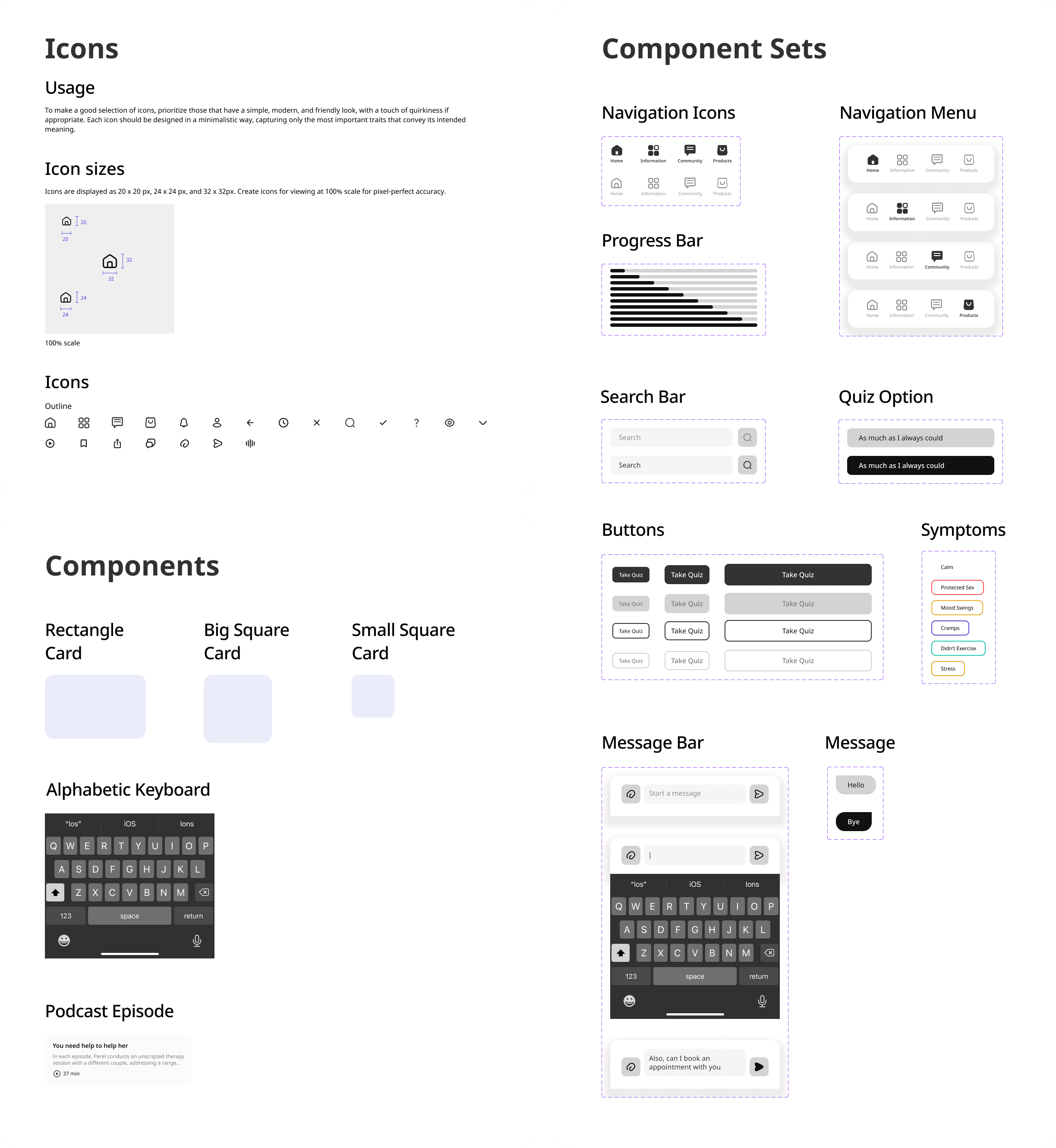
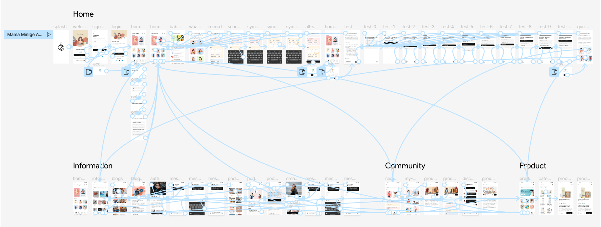
Hi Fidelity Screens
Finally, we turned our attention to creating our high-fidelity prototype, building from the lo-fi sketches we had previously designed. We created a variety of core elements (such as the navigation menu, message bar, menu bar, etc.) and saved them in our library assets to use and modify easily throughout the design process. We also created several vector illustrations using Photoshop which serve as icons within the app. The content within our app remained largely the same as in previous prototypes. We continued to draw from our previous user research to portray sample content (e.g., articles, community groups, products) that a user might encounter. For content related to sensitive health issues a user might be facing, we drew upon clinically validated and standardized screening tools, such as the Edinburgh Postnatal Depression Scale.

Milestone 4
For this milestone, created a hifi prototype with detailed attention to color, typography, iconography, layout, and navigation. We also include a design system along with our prototype. The design system consists of a color palette, typefaces, icons, and a grid layout.
Moodboard
In order to bring our lo-fi prototype to life, our team began by creating mood boards to hone our individual ideas on the aesthetic and feel of the app. We considered images, color palettes, material samples, and descriptive words to capture the essence of our app. We then discussed our mood boards as a group, identifying elements that we wanted to incorporate into our final prototype by considering what we wanted to convey, what might resonate with users, and what would be aesthetically pleasing.
Color Palette
We made the collective decision to keep black as our primary color and use a variety of different light-shade pastel colors as our secondary colors. We made this decision because information is a major aspect of the application and it will contain multiple images and illustrations derived from diverse informational resources. Using a range of background colors to showcase these images will help underscore the breadth of content within the app. Additionally, a range of pastel colors not only allows us to convey energy and vibrancy, but the light shades prevent the designs from being loud or overwhelming.
Logo Ideation
After finalizing our color palette, we then moved ahead to create a logo for our application. We first went on the internet and explored various illustrations and images for inspiration. As we needed to stick to the course objectives we prioritized the user experience of our application over creating specific illustrations at the time. And so, we picked 2 illustrations from numerous photos and vectors available online. We wanted to center our application around these illustrations as they effectively spoke about the purpose of the product. The logo was made using Golden Circle (plugin that calculates the sizes and position of your selected items automatically) on Figma.
After a very quick discussion and using dot voting, we finalized 2nd variant as our Logo.
Design System
After agreeing upon the color scheme and logo, we turned to our design system. None of our team members had previously created an advanced design system from scratch, thus we faced some difficulties learning and applying the concepts. In particular, creating component sets proved to be quite time-consuming.
Typeface:
Noto Sans typeface conveys a modern and clean aesthetic. It has a neutral and approachable feel that makes it suitable for conveying information in a clear and concise manner without distracting the reader with ornate or overly stylized features.
Hi Fidelity Screens
Finally, we turned our attention to creating our high-fidelity prototype, building from the lo-fi sketches we had previously designed. We created a variety of core elements (such as the navigation menu, message bar, menu bar, etc.) and saved them in our library assets to use and modify easily throughout the design process. We also created several vector illustrations using Photoshop which serve as icons within the app. The content within our app remained largely the same as in previous prototypes. We continued to draw from our previous user research to portray sample content (e.g., articles, community groups, products) that a user might encounter. For content related to sensitive health issues a user might be facing, we drew upon clinically validated and standardized screening tools, such as the Edinburgh Postnatal Depression Scale.
Milestone 4
For this milestone, created a hifi prototype with detailed attention to color, typography, iconography, layout, and navigation. We also include a design system along with our prototype. The design system consists of a color palette, typefaces, icons, and a grid layout.
Moodboard
In order to bring our lo-fi prototype to life, our team began by creating mood boards to hone our individual ideas on the aesthetic and feel of the app. We considered images, color palettes, material samples, and descriptive words to capture the essence of our app. We then discussed our mood boards as a group, identifying elements that we wanted to incorporate into our final prototype by considering what we wanted to convey, what might resonate with users, and what would be aesthetically pleasing.
Color Palette
We made the collective decision to keep black as our primary color and use a variety of different light-shade pastel colors as our secondary colors. We made this decision because information is a major aspect of the application and it will contain multiple images and illustrations derived from diverse informational resources. Using a range of background colors to showcase these images will help underscore the breadth of content within the app. Additionally, a range of pastel colors not only allows us to convey energy and vibrancy, but the light shades prevent the designs from being loud or overwhelming.
Logo Ideation
After finalizing our color palette, we then moved ahead to create a logo for our application. We first went on the internet and explored various illustrations and images for inspiration. As we needed to stick to the course objectives we prioritized the user experience of our application over creating specific illustrations at the time. And so, we picked 2 illustrations from numerous photos and vectors available online. We wanted to center our application around these illustrations as they effectively spoke about the purpose of the product. The logo was made using Golden Circle (plugin that calculates the sizes and position of your selected items automatically) on Figma.
After a very quick discussion and using dot voting, we finalized 2nd variant as our Logo.
Design System
After finalizing our color palette, we then moved on to create logo for our application. We first went to internet and explored various illustrations and images for inspiration. Then from numerous photos and vectors, we picked the below 2 illustrations and made logo for our application using G
Hi Fidelity Screens
After finalizing our color palette, we then moved on to create logo for our application. We first went to internet and explored various illustrations and images for inspiration. Then from numerous photos and vectors, we picked the below 2 illustrations and made logo for our application using G
Milestone 4
For this milestone, created a hifi prototype with detailed attention to color, typography, iconography, layout, and navigation. We also include a design system along with our prototype. The design system consists of a color palette, typefaces, icons, and a grid layout.
Moodboard
In order to bring our lo-fi prototype to life, our team began by creating mood boards to hone our individual ideas on the aesthetic and feel of the app. We considered images, color palettes, material samples, and descriptive words to capture the essence of our app. We then discussed our mood boards as a group, identifying elements that we wanted to incorporate into our final prototype by considering what we wanted to convey, what might resonate with users, and what would be aesthetically pleasing.
Color Palette
We made the collective decision to keep black as our primary color and use a variety of different light-shade pastel colors as our secondary colors. We made this decision because information is a major aspect of the application and it will contain multiple images and illustrations derived from diverse informational resources. Using a range of background colors to showcase these images will help underscore the breadth of content within the app. Additionally, a range of pastel colors not only allows us to convey energy and vibrancy, but the light shades prevent the designs from being loud or overwhelming.
Logo Ideation
After finalizing our color palette, we then moved ahead to create a logo for our application. We first went on the internet and explored various illustrations and images for inspiration. As we needed to stick to the course objectives we prioritized the user experience of our application over creating specific illustrations at the time. And so, we picked 2 illustrations from numerous photos and vectors available online. We wanted to center our application around these illustrations as they effectively spoke about the purpose of the product. The logo was made using Golden Circle (plugin that calculates the sizes and position of your selected items automatically) on Figma.
After a very quick discussion and using dot voting, we finalized 2nd variant as our Logo.
Design System
After agreeing upon the color scheme and logo, we turned to our design system. None of our team members had previously created an advanced design system from scratch, thus we faced some difficulties learning and applying the concepts. In particular, creating component sets proved to be quite time-consuming.
Typeface:
Noto Sans typeface conveys a modern and clean aesthetic. It has a neutral and approachable feel that makes it suitable for conveying information in a clear and concise manner without distracting the reader with ornate or overly stylized features.
Hi Fidelity Screens
Finally, we turned our attention to creating our high-fidelity prototype, building from the lo-fi sketches we had previously designed. We created a variety of core elements (such as the navigation menu, message bar, menu bar, etc.) and saved them in our library assets to use and modify easily throughout the design process. We also created several vector illustrations using Photoshop which serve as icons within the app. The content within our app remained largely the same as in previous prototypes. We continued to draw from our previous user research to portray sample content (e.g., articles, community groups, products) that a user might encounter. For content related to sensitive health issues a user might be facing, we drew upon clinically validated and standardized screening tools, such as the Edinburgh Postnatal Depression Scale.


REFERENCES
Cox, J.L., Holden, J.M., and Sagovsky, R. 1987. Detection of postnatal depression: Development of the 10-item Edinburgh Postnatal Depression Scale. British Journal of Psychiatry 150:782-786.
MamaMingle - Aesthetics
MILESTONE 3
REFERENCES
Cox, J.L., Holden, J.M., and Sagovsky, R. 1987. Detection of postnatal depression: Development of the 10-item Edinburgh Postnatal Depression Scale. British Journal of Psychiatry 150:782-786.
Figma File
View
Hi-Fi Prototype
View
Figma File
View
Hi-Fi Prototype
View